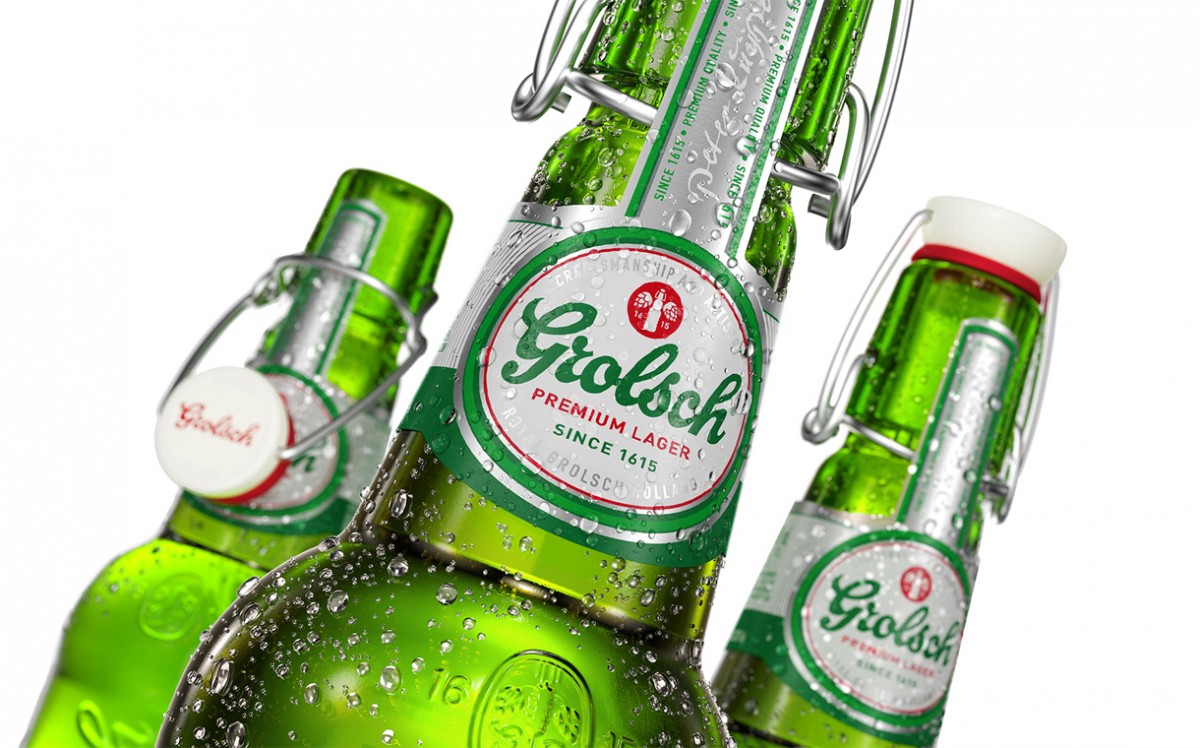
Grolsch appears in ‘modernised’ bottles
 Branding and packaging design consultant Cartils has redesigned Dutch beer brand Grolsch’s primary and secondary packaging to bring its new brand platform, Unconventional by Tradition, to life.
Cartils has simplified and modernised Grolsch’s packaging while retaining the recognisability of the brand’s strong legacy and authenticity. Cartils simplified the logo design and made it more contemporary by removing the outline and shading effects and by using a more “serious” green, it said. The red heritage mark has evolved to convey the Grolsch Unconventional by Tradition brand story, two hops and a swingtop. The icon has also been made more prominent on pack with “elements of discovery” incorporated too.
The circular main shape has been simplified in an effort to connect to the past, and to the origin of the swingtop, while layered lines and storytelling details emphasise the lager’s premium cues. The white-based colour is more refreshing and differentiated, yet ensures beer-cues, Cartils said.
The secondary packaging has been given added authenticity, with both “craftsmanship and artistry” and “unconventional by tradition” supporting texts providing a confirmation of Grolsch’s soul and spirit.
“The new design,” Netherlands-based Cartils said, “is connected to the past, showing 400 years of authenticity but in an up-to-date interpretation.”