Art captures the flavour of Absolut range | Case Study
Pernod Ricard’s Absolut Vodka brand has a track record of creating eye-catching special edition bottles. For its flavoured range of drinks the brand pulled out all the artistic stops for its new look, discovers Tim Sheahan.
The brief Renowned for its striking designs, Absolut Vodka owner Pernod Ricard handed The Brand Union the task of “bringing to life” design ideas on glass with its new designs
Client Pernod Ricard
Brand Absolut
Project Manager The Brand Union
UK launch date June 2013
The Absolut range of vodkas have always embraced creative flair when it comes to presenting the product on the shelves of shops and bars across the land. Striking, sometimes through their simplicity and through elaborately-developed packaging throughout, the bottles have always made an impression.
Only several months ago, the brand underwent a redesign for a limited edition travel range that incorporated photography inside the bottle for the first time. Celebrating a blend of “the arts of photography and illusion”, the exclusive run featured work from Swedish artist Johan Renck. So when it came to a complete overhaul of its flavoured vodkas range, it came as no surprise that parent company Pernod Ricard wanted to go all-out to ensure the new-look bottles packed a punch.
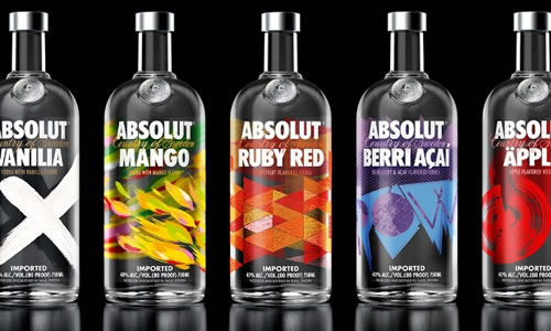
Stockholm-based The Brand Union was tasked with revamping 11 of these flavours, including vanilla, mango, pear, cherry and grape as well as more unusual numbers such as wild tea and cilantro.
“We were briefed to break convention and give our customers something unlike they’d ever seen before. To redesign one bottle is a significant project alone. To redesign 11 all at the same time represented a hugely ambitious design project,” explains Jonas Andersson, executive client director of The Brand Union. “It required the coming together of a true multi-disciplinary project team encompassing brand strategy, design, communications, sensory experts and bartenders and production.”
Evolving the brand
Andersson explains that the project was not about changing an established brand, but rather evolving a brand that has continued to “challenge the norm” ever since it launched in 1979.
“This desire to innovate and place design at the very core of the company – a strategic approach in itself – is what sets Absolut apart and is very much part of our DNA. Therefore, this latest redesign is our way of ensuring we continue this spirit and evolve the brand in an authentic manner,” he adds.
Central to this undertaking was a brief that required The Brand Union to avoid convention and embrace the themes and symbolism tied to each flavour. Rather than include a basic image of the fruit or spice that is found inside, the agency instead looked to promote the essence of the flavours found within each vodka.
Andersson and his team took inspiration for the design from contemporary art, which he feels resonates with the Absolut brand, as well as themes of nature, which is a very strong influence historically within Swedish art and culture.
Andersson says: “Since 1985, when the Absolut Vodka bottle appeared in the first art ad, Absolut has been making art part of its consumers’ experience. Its history as a brand is characterised by a bold, curious and creative spirit, always seeking to disrupt; and this redesign is the latest evolution of the company’s desire to create beautiful, original packaging that reflects each individual product in a unique way.”
In addition to the intricate design work, The Brand Union placed a strong emphasis on the hand-made element of the bottles and printing onto glass.
Absolut bottles have been decorated through a screen printing method since coming on to the market in the 1970s. The agency liaised with Absolut’s screen printing team as well as its design team to ensure the final designs were “brought to life” on glass.
Andersson explains: “The best word for describing our process is craft. South west Sweden in particular has a rich tradition of glass-making and material knowledge. A deep expertise of the canvas which we work upon is very important.”
The fruits of their labour came to market in June 2013. Mathias Westphal, global brand director at Absolut says the response to the new designs had been “overwhelmingly positive”.
“Uniquely Absolut”
“What has most been commented upon is that the design idea really feels intuitively and uniquely Absolut, with our long art heritage. The design executions are beautiful and have a deeper meaning than just fruit on bottle as they express the essence of each fruit. They have great stand-out,” he says.
According to Anna Kamjou, global design director at Absolut, the company was particularly impressed with the coherent results achieved by the agency.
“We and The Brand Union are very proud of the designs, and extremely pleased with how they have been realised in our glass production,” she says. “It’s hard to pick out particular elements but generally we are happy that the designs are really artistic and have texture, more coherent as a range, go beyond just depicting fruits on the bottle and bring to life the essence of each flavour.”

